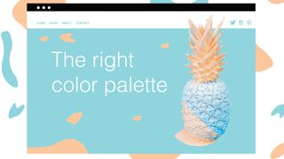
Choose the perfect colour palette for your website
How to use colour theory to create the right palette.
While there are many steps in creating a website, branding is one of the most important. Whether you're working for another company or simply designing your own web design portfolio, it's vital to choose an approachable and relatable colour palette. This can seem a bit tricky, but don’t fret! In this article I'll offer some advice for finding the right colour palette for you, using psychological studies and colour theory.
Know what emotions colours evoke
You may have an idea of what you’d like the colour palette for your business to be, but before you set anything in stone, try to take a look at what the colours you’re thinking of using actually mean. That means asking: Do the colours convey the right emotions and are they attractive to my target market? It might seem like a silly question, but you can gain a lot of insight by looking into the psychology of colours.
Think of the logos of some companies you know, like Coca Cola, Facebook and Apple. They are three incredibly recognisable brands, all of which you can likely recall the colour of their logos as red, blue, and white. For a more in-depth look at this, take a look at our article on outstanding uses of colour in branding.
While a logo’s colour may seem like a casual choice made by the brand, you can be assured a lot of thought went into it. The colours used in the logos of these brands exude what they stand for – or at the very least, what they’re trying to stand for.
If you're confused or lacking inspiration, the best place is to start is by playing around with some online colour tools. There are plenty of these around, and you'll find our pick of the best ones in our roundup of the best colour tools for web designers.
Choose your dominant colours
Once you're feeling inspired enough, you can begin choosing your main or ‘dominant’ palette colours. These are the colours that you will want your target audience to recognise you by. They will adorn your website and business cards, so it’s important to get them right.
While it’s not imperative, you’ll most likely only want two dominant colours, with the others left as accent colours (we'll cover these later on). It’s also important to note that out of your two dominant colours, one will be used more than the other in your branding materials, whether it be a website, banner or anything else.
Explore different tones and tints to find the right balance
First and foremost, your dominant palette colours should either complement each other or contrast well together, and neither should outshine one another. If they do, you can play with tints, tones and shades to find a happy balance between the two. Here’s a quick explanation of these last terms:
Tones: Mixing grey to a pure colour
Tint: Mixing white to a pure colour
Shades: Mixing black to a pure colour
This isn’t a step that’s to be rushed, as these will be the defining colours of your brand. You’ll be happy that you spent the extra time finding the perfect colour values.
Choose your accent colour(s)
Accent colours play an incredibly important role – they’re supposed to draw your viewer’s eyes to something you want to highlight. A poor choice can make people miss what’s essential for you. Accent colours are usually bolder than your dominant colours.
Accent colours draw attention to key elements (here, the orange CTA)
For your website, accent colours are best applied to elements like your navigation menu, calls to action and other crucial items that you would like to showcase. A great example of a successful accent colour application can be found in the Design Conference template by Wix.com. The red accents on the menu show you what section of the page you are on and the bright Buy Tickets call to action is begging to be clicked.
Apply with the 60-30-10 rule
With your colour palette complete, it’s time to give yourself a pat on the back, but you’re not done just yet. The way you actually apply your colour scheme matters, and you can let the popular 60-30-10 rule guide you: use 60 per cent of your dominant colour, 30 per cent of your secondary colour and 10 per cent of your accent colour. When it comes to web design, you can rework the rule as 60 per cent negative space, 30 per cent content, and 10 per cent ‘call to action’ elements.
This is a good rule of thumb when applying your colour palette
One good way to visualise this rule comes from MMI Creative: “Think of a man in a business suit: 60 per cent is the slacks and jacket, 30 per cent is the shirt, and 10 per cent is the tie”. By following this rule, you will be able to achieve balance both in colour and content for your website.
Discover what it’s like to be a user interface designer, and some tips for becoming better at your craft.
When I started my career, I was a web designer. I worked in web design for four years, starting with small business sites and eventually moving on to bigger clients. I found out that it wasn't graphic design that interested me, nor working for bigger brand names. I was more interested in pagination patterns, the way people interacted with forms, and things like perceived performance, than the visual design of a web page.
When I watched sci-fi movies, I would look at the interfaces. And when I played videogames, I would observe the way the menus were laid out. If any of these traits sound familiar to you, you might also be a UI designer at heart.
I quit my agency job and started my own company. On my LinkedIn page, I tried to summarise my new career goal: to make the best software possible. It's been four years since I started as a freelancer, and my journey hasn't stopped. These days I help run a small UI design company calledMono. We recently welcomed our fourth team member.
In this article I want to describe what it's like to be a UI designer, including what exactly the job entails, where to find the best learning resources, and how to get better at your craft.
What does a UI designer do?
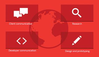
A UI designer’s job can be roughly split into four key areas
I find that generally you can divide the work of a user interface designer into four categories. You communicate with the client, you research, you design and prototype, and you communicate with the developers. Let's take a look at each of these phases in more detail.
Client communication
Client communication is all about understanding the client's problem. The goal is to get to grips with your client's business, so the beginning of a project typically constitutes a lot of talking. It's fine not to know too much about your client's domain when you start out – you can look at their business in a fresh way while you envision possible design solutions.
To be a good UI designer, you need to be able to eventually think along with your client's business. For example, your client might be in aviation. Working for them will eventually make you pretty knowledgeable about that industry. So, a tip for your own happiness here is to choose the industries you work for wisely, so you don't end up being an expert in something you don't care about or have no interest in.
During a project, the communication doesn't stop. As a designer, you will be presenting your work constantly. At our company we are a remote team, so we don't have many in-person meetings. Instead, we make heavy use of screen sharing through video conferencing. Communication tools like Skype and Slack are used every day.
It's useful to combine synchronous and asynchronous communication methods. A call is great if you need a lot of information quickly, but you have to be around at the same time. We think of Slack as our 'virtual water cooler' and use Basecamp to manage complex design projects. When we design prototypes using HTML and CSS, we use GitHub Issues to discuss code directly.
Research
As well as client communication, you will do a lot of research. This could include field studies, workshops with the client, analysing the competition or defining a strategy – essentially, just about anything that helps you understand the problem at hand.
Research is what informs your design choices. It's an article you once read, or that new thing Apple just released. When it's time to explain why you made a particular design choice, your research backs you up.
Research can be very broad. I often test new devices for research purposes or sign up to a new web app to study its user interface.
Design and prototyping
As a designer, you will likely spend most of your time doing design and prototyping work. A UI design project can move forward in any number of ways, from sketching, to detailed design, to coding.
The method you use largely depends on the type of project. What are you designing? Is it a website, or would you rather call it an app? Does it use native technology? Is it a redesign or are you starting from scratch?
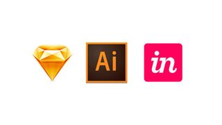
Some of our tools of choice: Sketch, Illustrator and InVision
At our company there is no fixed process, but most projects follow the same rough order: they start with sketches and wireframes, go on to detailed visual and interaction design, and end with a prototype.
As designers, we spend a lot of time thinking about our tools. While great tools are important, they aren't the most important thing. Being able to use the Adobe Creative Suite and apps like Sketch competently is the equivalent of being able to use a pencil to draw or a brush to paint. You still need to make the painting.
That being said, a healthy interest in tools is a good thing. I love trying new tools that can help me to be more productive. My favourite vector editing tool is Illustrator, but most of my visual design work is done in Sketch these days. Other team members have switched to newer tools like Affinity Designer.
Tools are a very personal choice. As long as we can easily work together, everyone is free to choose their own. To make it simpler to talk about our designs with clients, we make prototypes with InVision. For more advanced prototyping, however, we use HTML and CSS. The tool you need all depends on the job you want to do with it.
Developer communication
An oft-forgotten part of the work of a UI designer is developer communication. These days you can't get away with just sending your designs off to the devs and hoping they get implemented correctly. The best designers know the challenge isn't in creating the design, but in communicating it – not only to the stakeholders who have to give their approval, but also to the developers who have to implement it.
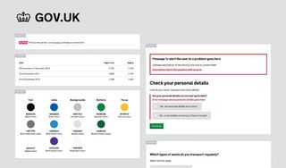
GOV.UK provides a guide to enable users to make their service consistent with the main site
Communicating a design comes in many forms: detailed specifications, providing assets, reviewing the design together. What it makes sense to deliver in each instance largely depends on whether the project is a native or a web application.
The traditional approach is to deliver assets next to screen designs. The screen designs can be used to see what the design will look like as a whole, while the assets are ready-to-use PNGs and SVGs of icons, so the developers don't have to deal with a graphics editor.
At our company we are proponents of delivering more than that. We use component style guides to help maintain consistency in our designs. When we're dealing with a web project, we deliver detailed sets of HTML and CSS, documented piece by piece, ready for implementation. I believe that having a design eye in every phase of software development is the only way to reach my goal of creating world-class software.
Web vs native apps
When you design a native app for a platform (e.g. iOS or Android), you tend to adhere to certain guidelines. When you design for the web, there's not so much guidance. What typically happens is that your client has a set of graphic guidelines for their brand that determines how things should look.
However, these guidelines tend to be tailored towards marketing websites, and what's in there doesn't always lead to good user interface decisions. Fonts tend to be chosen for marketing reasons, not for legibility reasons. Colours may be bold and striking, which works in an ad campaign, but not in an app you use day-to-day. These guides have to be interpreted.
There are few UI guidelines for the web. You could argue the web is a melting pot of different styles. If you are making anything that feels more like an app than a website, you need to know about widely used frameworks like Bootstrap and ZURB Foundation. The framework starts to determine how things should look, because you don't want to reinvent the wheel. And that's probably a good thing.
At our company, we like to use Bootstrap. It provides sensible default sizes for common UI elements like buttons, data tables and modals.
In web design, you are more constrained by the technical capacities of the web. It used to be that it would be difficult to implement simple visual flourishes like rounded corners on a website. These days are long gone – you now are free to draw user interfaces with plenty of shadows, transitions, animations and even 3D.
As a designer, it's way more realistic to take control over the process and design in the browser. I haven't seen many UI designers take over the UI programming of a native app, but a designer doing the HTML and CSS of a web app is a common occurrence. If you can code your own designs, you will have an edge over your non-coding peers, and to me it's the only way to truly understand how the web works.
Web constraints
You will soon discover that not all the cool tricks you learn are supported in every browser, and that's the reality of designing for the web. It's good to follow well-known principles like progressive enhancement, where you load enhanced content whenever possible, but also think about how the content degrades.
Recently, 'cutting the mustard' has become popular. Championed by the BBC's web team, this involves differentiating between 'good' and 'bad' browsers, and providing a limited experience to 'bad' browsers. However, it really only works for content sites.
When it comes to application-like experiences, many people are limiting support to a few leading browsers only, to make development easier. Sadly, this brings us back to the 1996 situation where you need a certain browser to view content.
Improving your skillset
So, how do you keep up to date with the fast-moving web industry and improve your skillset? Let's look at a few different methods for boosting your skills ...
Platform knowledge
A major part of a designer's arsenal is platform knowledge. You should know about the various operating systems, and how people are using them. As designers, we tend to use Macs, but then it's easy to forget that the majority of people out there are using Windows boxes to get their work done.
I feel you can only truly understand something if you use it yourself. I prefer using my Mac to design, but spend a lot of time catching up on the evolution of various other platforms. I have several copies of Windows installed on my Mac as virtual machines. I've been busy testing new builds of Windows 10 using Microsoft's Insider Program to check out the various changes in the UI.
I also regularly buy new hardware to test how it works. I bought an Apple Watch just to test the platform. I then sold it because I felt it wasn't adding so much to my life.
Further to this, the web can be seen as its own operating system. It's constantly evolving, with new features being added to every browser vendor each week. It's extremely worthwhile to know about the technical aspects of browsers, especially regarding CSS and graphics abilities. You need to know what SVG and WebGL are, and how you can use the Web Animations API.
Every platform evolves over time and as a user interface designer it's your task to stay up to date. After all, whatever you are designing doesn't live in isolation, but is part of a bigger software ecosystem.
Go back to the basics
What we are struggling with today is not so different to what we were struggling with 20 years ago. There is a ton of good advice in books. Try Defensive Design for the Web by Jason Fried and Matthew Linderman and Don't Make Me Think by Steve Krug for starters.
If you don't know about concepts like modality and affordance, you need to read up. You should to be able to explain what Fitts' law is. The Gestalt law of proximity? This is the bread and butter of UI design.
Get inspired by games and films
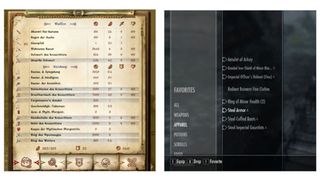
The UI for 2006’s Oblivion (left) is much more decorative than that of Skyrim (right), released in 2011
As a UI designer, I draw on other sources of inspiration to do my work. I find a lot of inspiration in games. Some games are very complex, and the UI designers have had to solve the same complex interface problems as UI designer working on business projects.
Games can also signify trends. The minimalism found in the menus of Colin McRae Rally reminds me of the direction of iOS7. In a way, the UI animation design that is now trendy was appearing in games years and years ago. The move from skeuomorphism to bare, functional interfaces and 'flat design' has been apparent in games too. Compare 2006's Oblivion with 2011's Skyrim. Both games are RPGs in the same series, but the difference is striking.
The futuristic interfaces in Marvel films like Iron Man have also been an inspiration for me. They aren't exactly usable examples, but they do make me think more about computing as a whole. Do we want a future of screens, or do we want the screens to disappear? This is probably a good question to pose in a pub full of designers.
You grow as a designer through hard work, persistence, talking to your peers, and reading an awful lot. About a year ago I read a piece in the New York Times about people well into their 80s that continue to hone their craft. I feel like I'm only starting. What about you?
When it comes to graphic design, fonts play an integral role. But if you’re not a designer, you might be asking yourself:
“What fonts actually go well together?”
Not to worry! In this post, we’ve laid out 50 perfect font combinations that you can use in your designs today. Of course, all fonts mentioned in this post are included in Snappa.
Now before we begin, let’s go over some quick terminology so you can better follow the different font combinations that we outline in this post.
Serif: Serif typefaces are those in which a small line is attached at the end of the stroke in a letter or symbol.
Sans-Serif: Sans serif typefaces are those that do not contain serifs at the end of strokes. Hence the term “sans-serif.”
Scripts: Script typefaces are those in which many characters have strokes that join them to other letters similar to cursive handwriting.
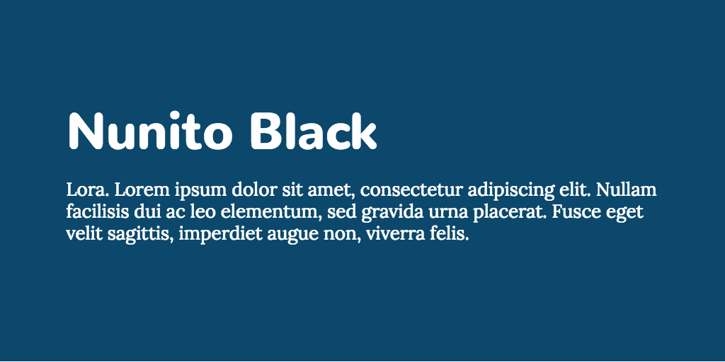
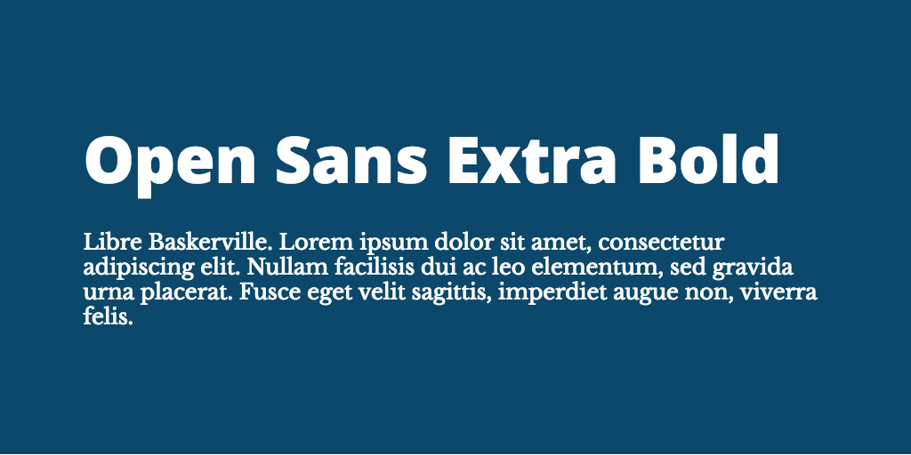
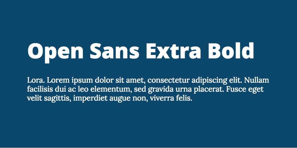
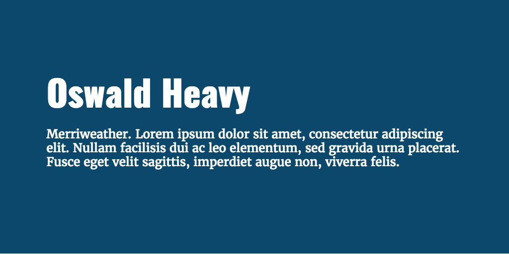
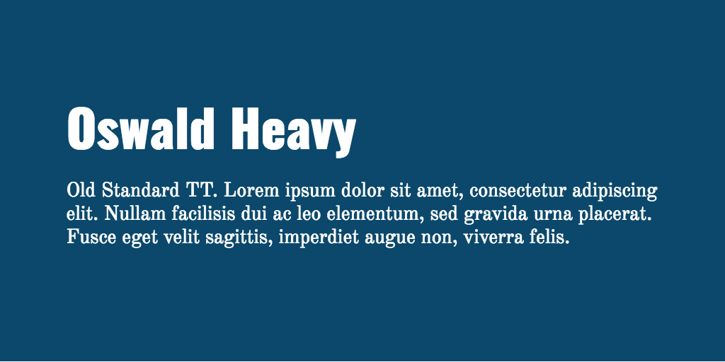
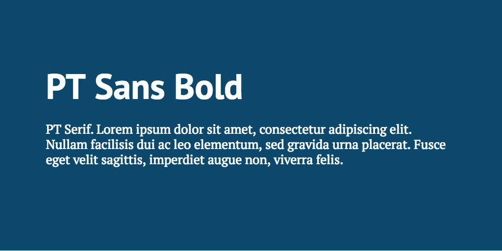
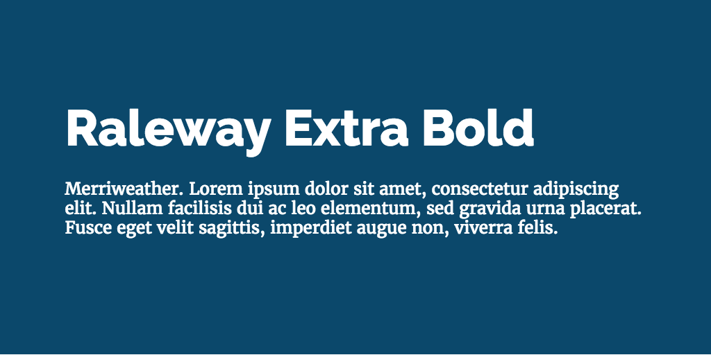
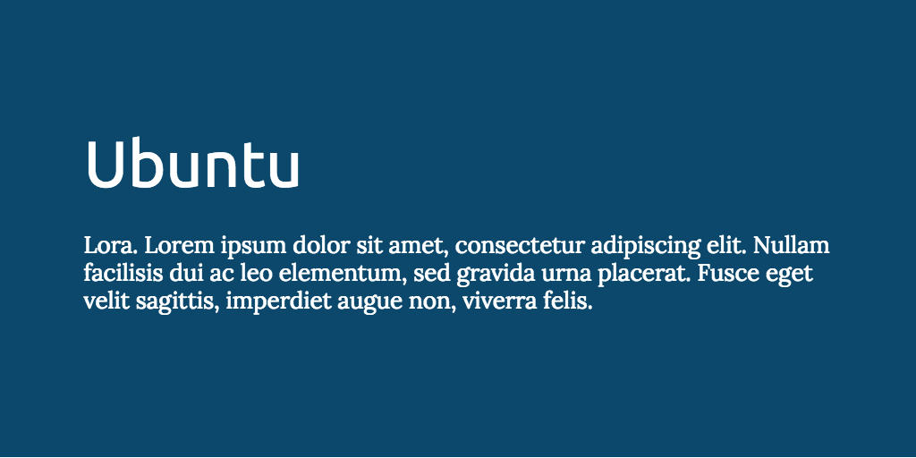
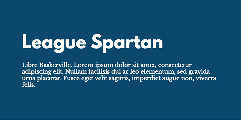
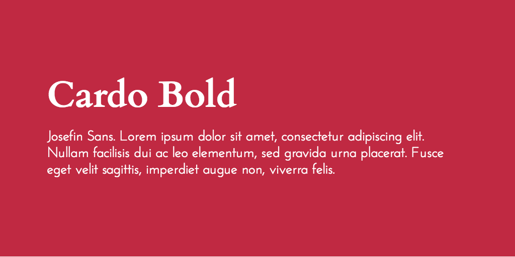
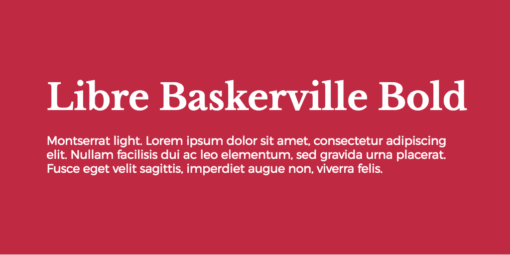
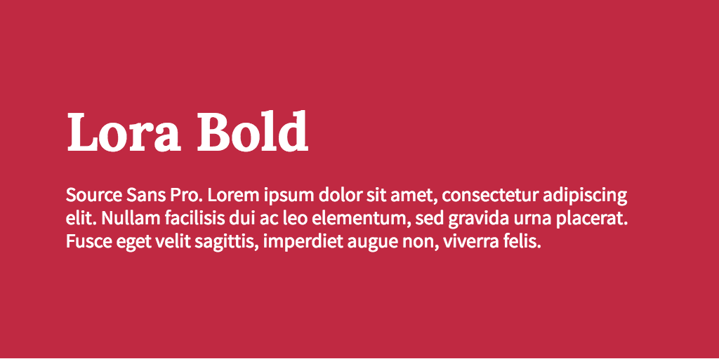
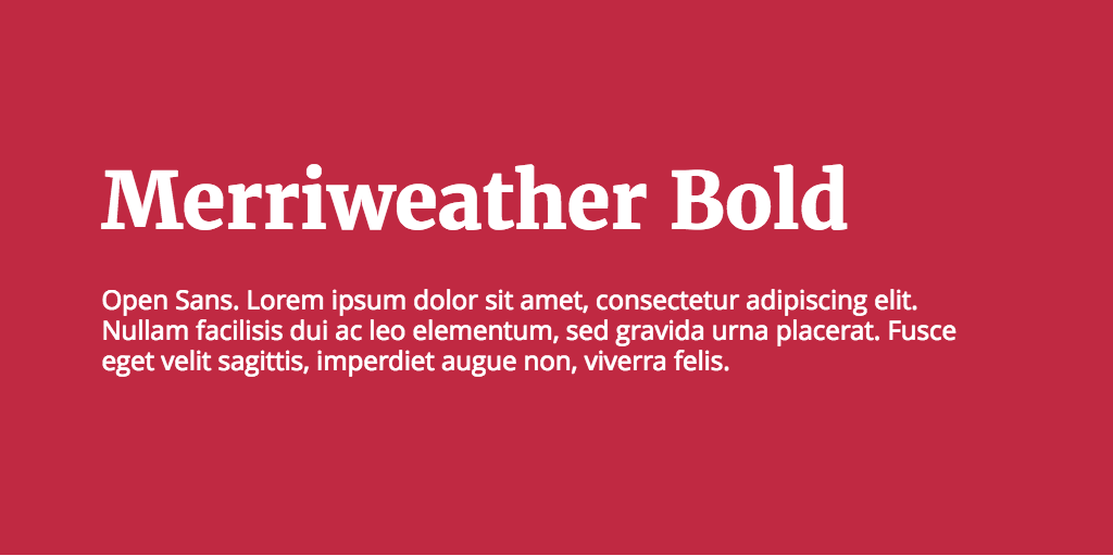
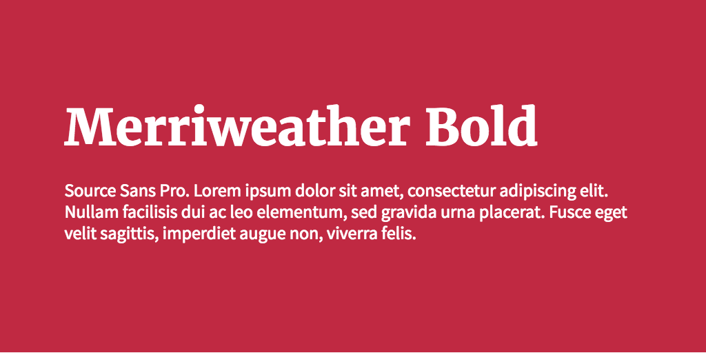
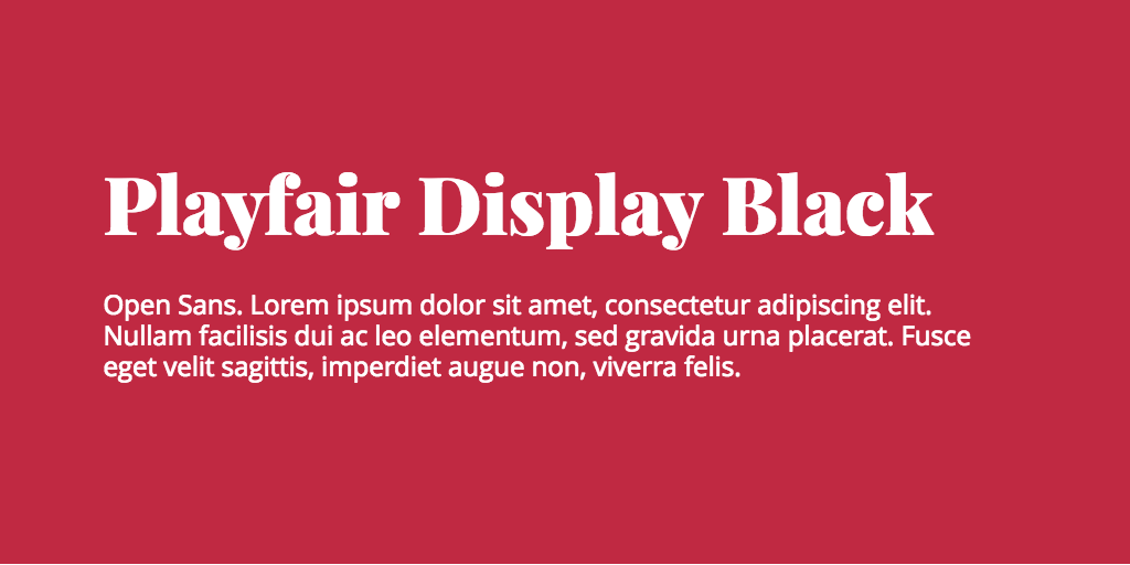
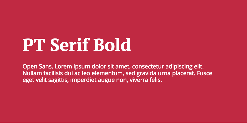
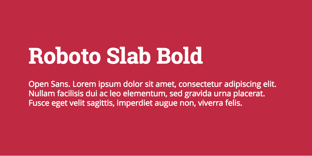
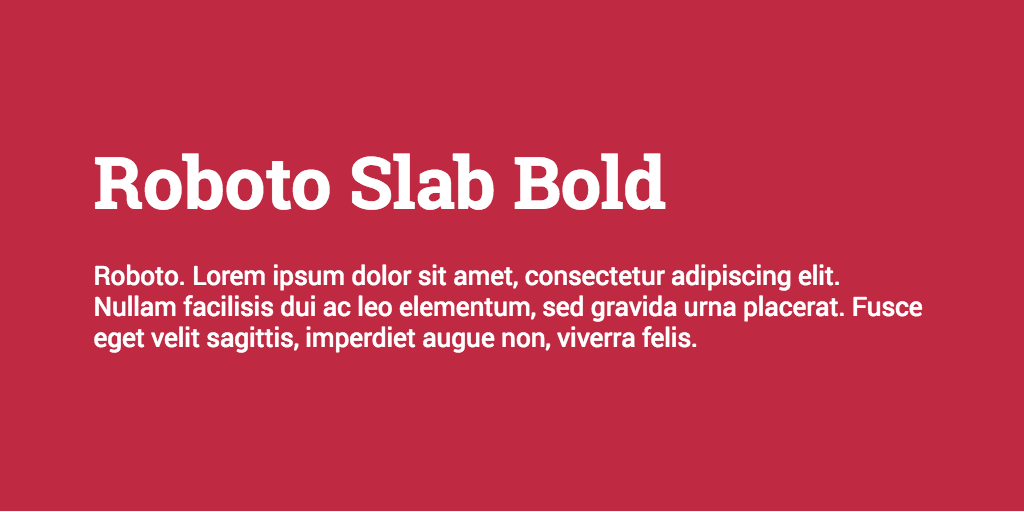
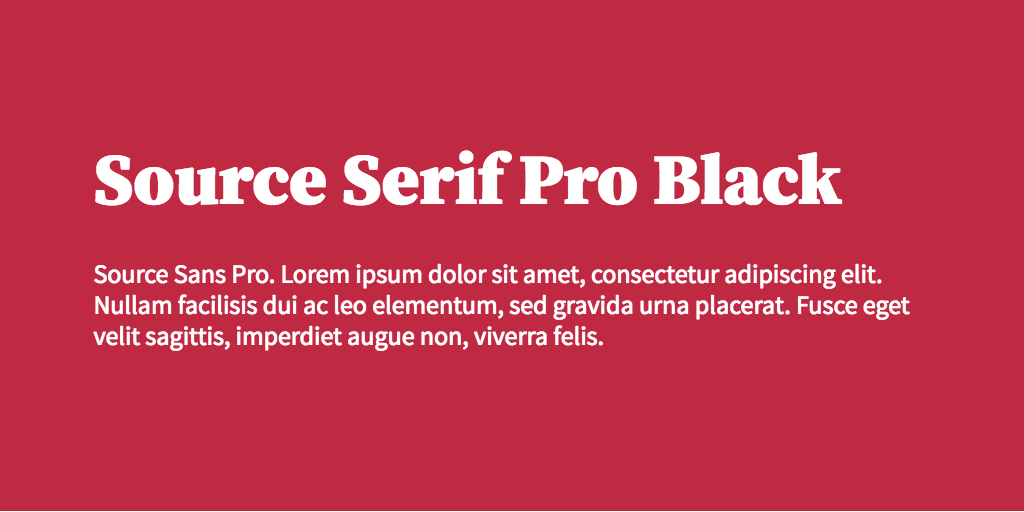
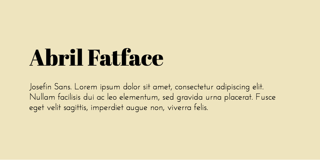
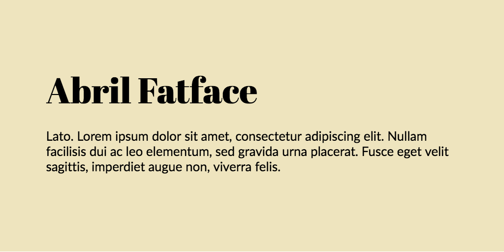
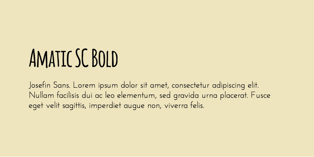
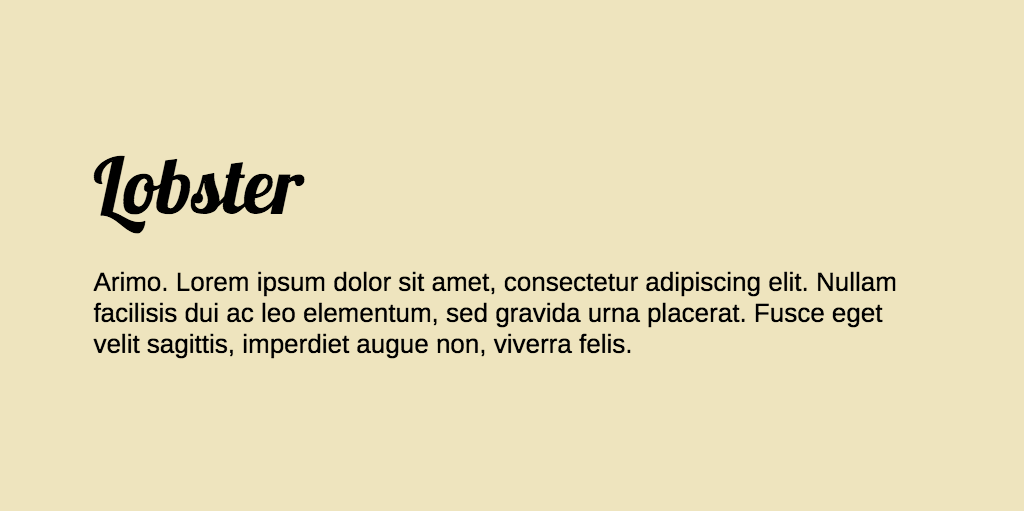
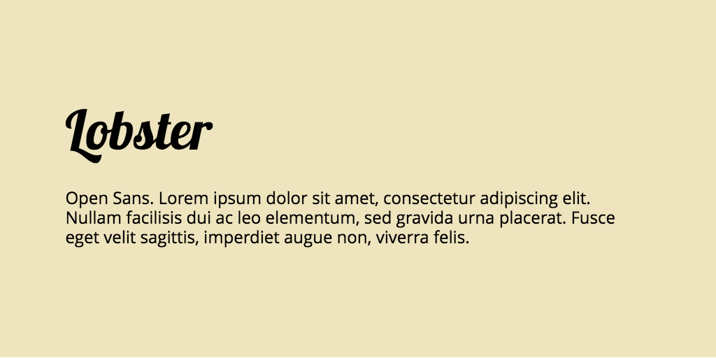
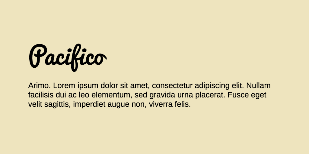
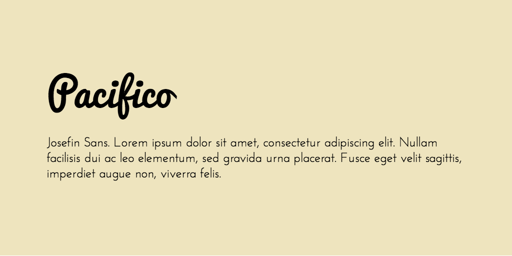
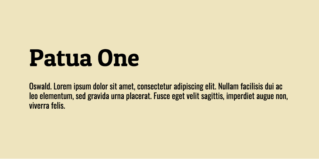
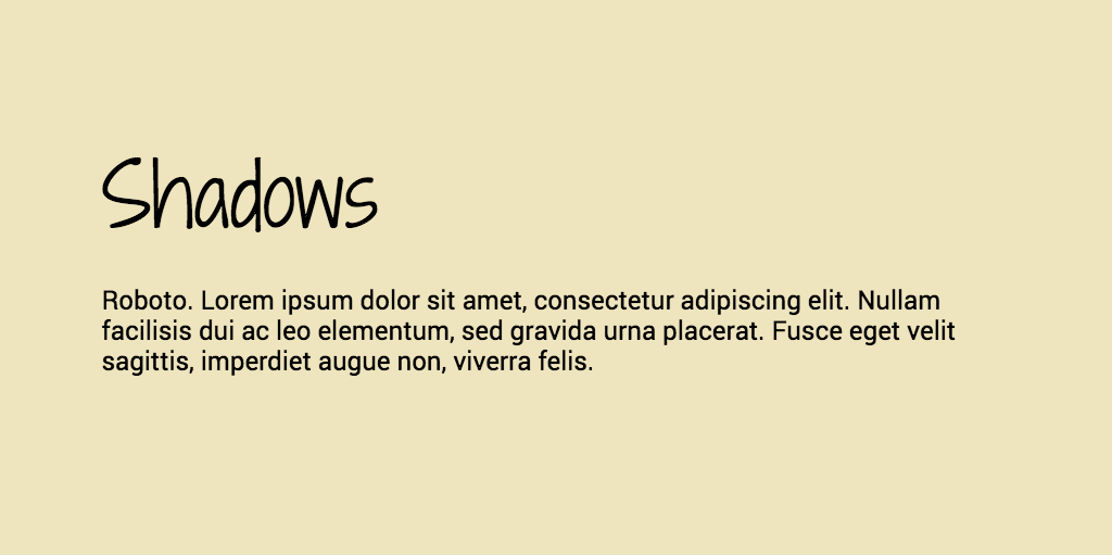
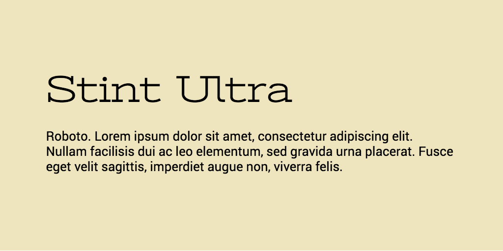
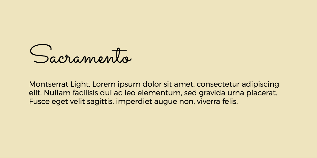
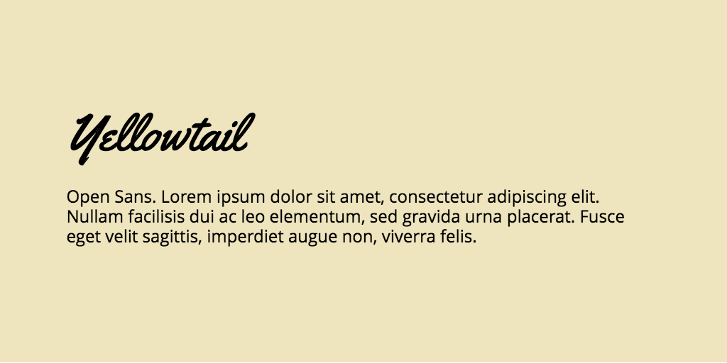
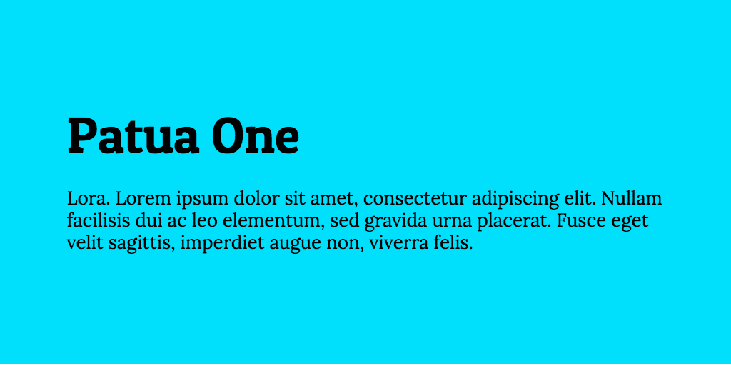
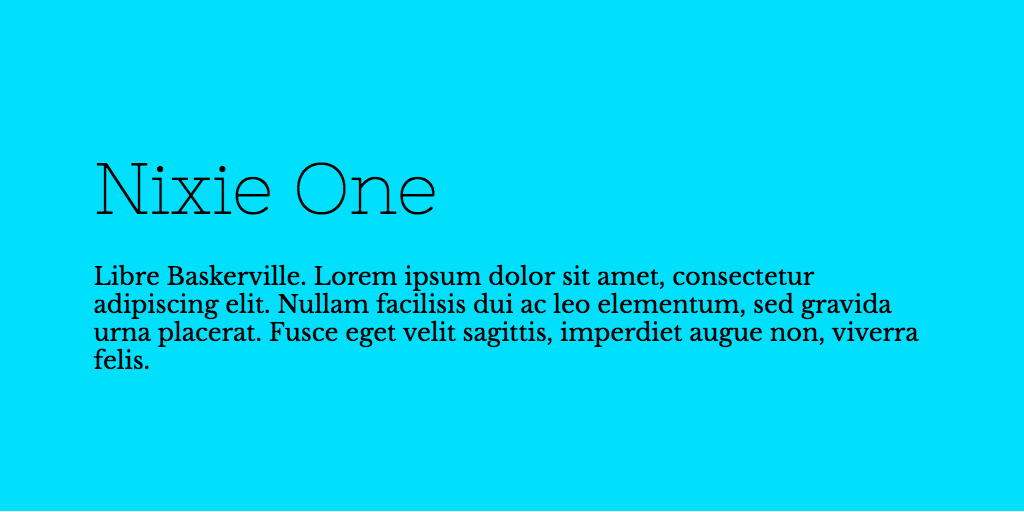
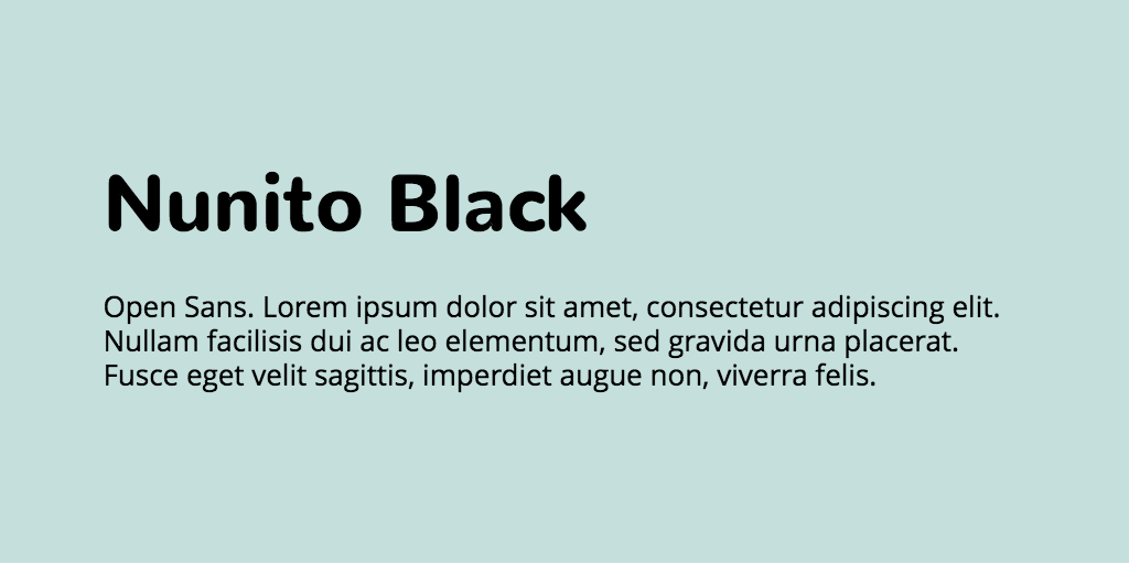
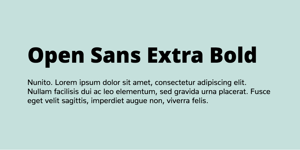
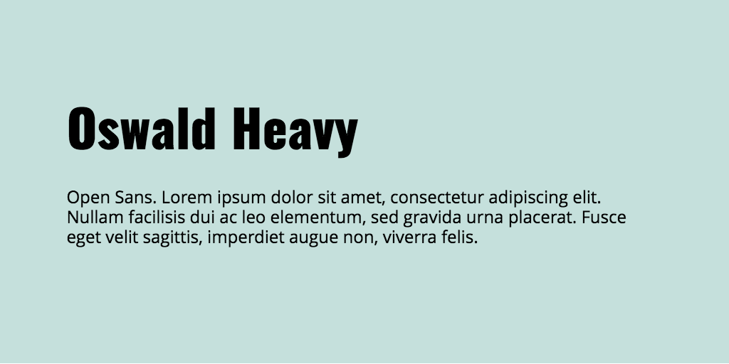
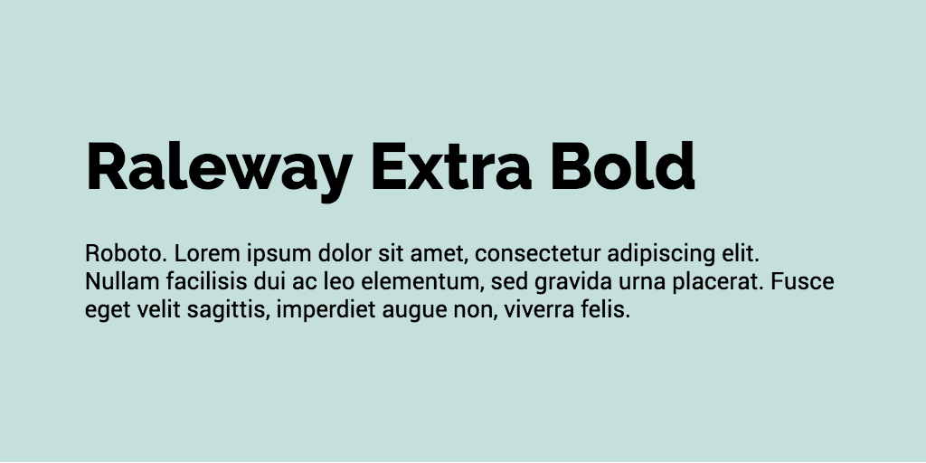
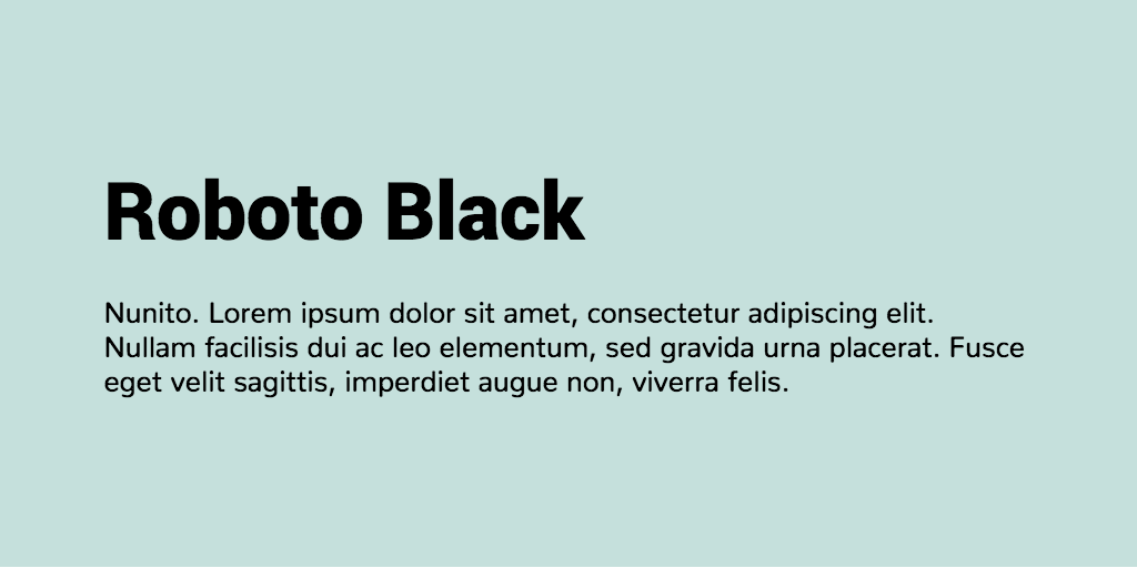
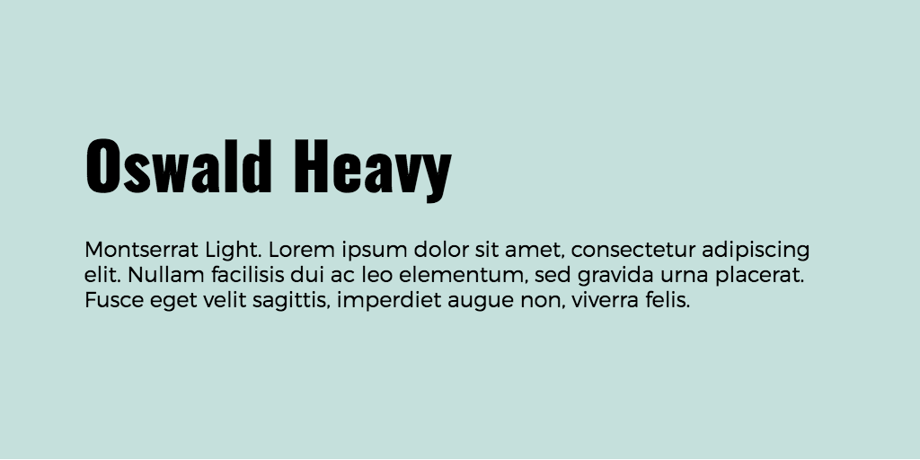
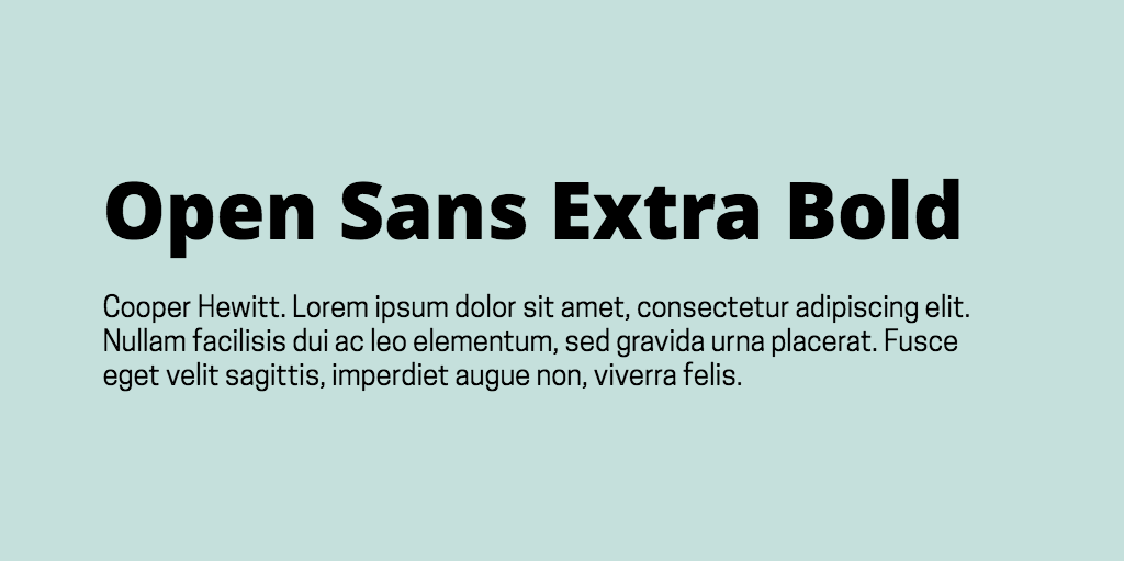
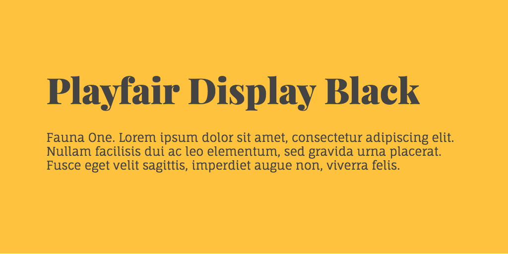
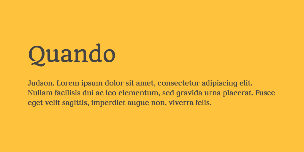
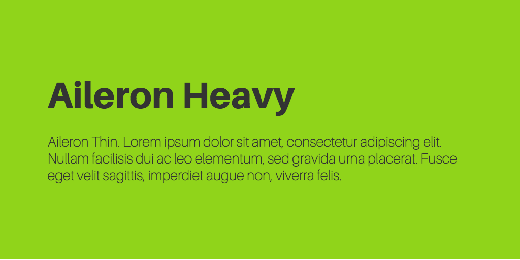
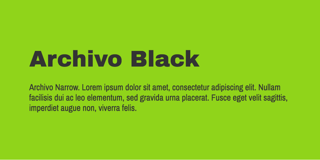
Here’s a visual representation of the different types of fonts discussed in this post.
With that out of the way, let’s move on to the 50 perfect font combinations to kickstart your next design.